How Airbnb’s UI Led Me to Build My Own Design System
Stick with me for a second. I am planning on visiting a friend in San Antonio, the magical city with a river running through it. #iykyk 😅 For hospitality I went right to Airbnb and the UI/UX blew me away. It had been a minute since I had used it.
I really liked the aesthetic and it made me curious about why it felt so polished. When you look closely, a lot of good interfaces follow a handful of simple design rules.
For example:
Consistent spacing rhythm. Interfaces feel more organized when padding, margins, and gaps follow a consistent spacing scale.
Clear visual hierarchy. Typography, color, and size should guide the eye toward the most important action first.
Generous border radii for warmth. Rounded surfaces soften an interface and make it feel more welcoming.
Content alignment across surfaces. Text, icons, and controls should align consistently between cards, lists, and sections.
Depth through subtle elevation. Light shadows and layered surfaces help users understand grouping and interaction.
Predictable interaction states. Hover, focus, loading, and disabled states should behave consistently across controls.
For me it was the exaggerated radii that really stood out. The rounded edges create warmth and softness. And personally, it’s something I would never use.
For context, I am building an app to help folks find a therapist who might be a good match for them. My default aesthetic with very small rounded edges just was not going to give the right feeling. That realization pushed me toward building a design system that could guide the aesthetic while developing the app. More importantly, the system helps keep things simple and consistent so people know what to do when they land on the app.
That realization pushed me toward building a design system that could guide the aesthetic while developing the app. More importantly, the system helps keep things simple and consistent so people know what to do when they land on the app.
While building the app I started noticing a little drift in the components. Spacing would be slightly different. Border radii would vary. Small inconsistencies started creeping in and the UI slowly began to lose its cohesion.
When I first learned about Storybook I thought it was a neat toy to play with, but it took forever to set up and it did not seem worth the lift. Now in hindsight, I get it. Storybook is not just a component sandbox. It helps develop principles and guardrails for engineers so a product can maintain a cohesive look and feel over time. Without those guardrails the interface becomes harder and harder to manage.
As I dug deeper into design systems I realized there is a lot to learn. As what I consider good practice, I asked ChatGPT to generate a glossary of design system terms to help build a mental model and establish a shared vocabulary.
It is important to note that these definitions are based on my current thinking and approach. A design system is not something static. It should evolve over time as the product and the team learn what works. That is one of the things that makes Storybook so powerful. When components live in a shared system, you can make a change in one place and that improvement can propagate everywhere the component is used. Storybook provides a safe environment to see those changes, document them, and keep the interface consistent as the product grows.
That being said, here is a link to the Storybook for this project.
That glossary follows below.
Design System
A design system is a structured collection of UI rules, tokens, and reusable components that define how product interfaces are built.
A design system typically includes:
visual foundations (colors, typography, spacing)
reusable UI primitives
interactive components
composable patterns
documentation and usage guidance
The purpose of a design system is to:
maintain visual consistency
reduce duplicated UI work
enable faster feature development
provide shared standards across teams
A design system describes how UI should be constructed, not just what UI looks like.
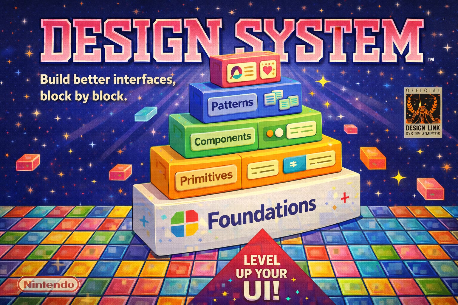
Composition Ladder
The composition ladder is the architectural hierarchy used to organize UI elements within a design system.
The ladder defines how higher-level UI is constructed from lower-level building blocks.
Typical structure:
Foundations
→ Primitives
→ Components
→ Patterns
→ Product
Each layer builds on the layer below.
The composition ladder helps prevent:
premature abstraction
duplicated UI logic
uncontrolled component growth
Foundations
Foundations define the visual rules and tokens used across an interface.
Foundations do not render UI elements. Foundations define values and constraints that other UI layers consume.
Common foundation categories:
color tokens
typography scale
spacing scale
radius scale
elevation levels
motion timing
Example responsibilities:
color tokens define semantic roles such as primary, background, and error
spacing tokens define layout rhythm and alignment
typography tokens define readable text hierarchy
elevation tokens define depth relationships between surfaces
Foundations provide the visual physics of the design system.
Primitives
A primitive is the smallest reusable UI surface with visual meaning.
A primitive typically represents a basic visual building block, not a feature or interaction.
Primitive characteristics:
reusable across many features
minimal configuration
no business logic
no feature-specific assumptions
Examples of primitives:
panel / surface container
banner or message surface
divider
layout container
labeled row
A primitive often defines:
background
spacing
border radius
elevation
basic structure
Primitives provide the structural surfaces that higher-level UI builds upon.
Components
A component is a reusable UI element that introduces interaction and state.
Components remain product-agnostic but include user behavior.
Common component responsibilities:
handling user input
managing visual interaction states
communicating feedback
Examples of components:
button
text input
toggle switch
dropdown menu
tag input
Typical component states:
default
hover
focus
disabled
loading
error
Components are the interactive controls of a design system.
Patterns
A pattern is a reusable assembly of primitives and components that solves a recurring interface problem.
Patterns represent common UI structures rather than individual controls.
Examples of patterns:
form section
editable list
accordion
card layout
profile editor
Pattern characteristics:
composed from primitives and components
reusable across multiple screens
may include limited structural assumptions
Patterns help teams avoid rebuilding common interface structures.
Product Surface
A product surface is feature-specific UI tied to a particular application domain.
Product surfaces are not intended for universal reuse across the system.
Product surfaces may depend on:
domain data models
application routing
feature logic
business rules
Examples:
user profile card
discovery result card
checkout confirmation panel
account settings editor
Product surfaces typically compose primitives, components, and patterns to implement feature-specific UI.
Reuse Promotion
Promotion Ladder
The promotion ladder describes how UI elements move upward into the design system as reuse becomes clear.
A new UI element should begin at the lowest correct layer and move upward only after reuse is proven.
Example progression:
Product element
→ Pattern
→ Component
→ Primitive
This approach prevents premature abstraction and ensures the design system grows organically.
Reusability
Reusable Element
A reusable element is a UI element designed to be used across multiple screens or features.
Reusable elements should:
avoid feature-specific logic
avoid domain assumptions
maintain clear and minimal APIs
Reusable elements usually belong in:
primitives
components
patterns
Coupling
Feature Coupling
Feature coupling occurs when a shared UI element depends on specific product logic or domain data.
Example of coupling:
a button component that assumes a specific API structure
a card component that only works with one data model
Design systems aim to minimize feature coupling so shared UI remains flexible and reusable.
Token
Design Token
A design token is a named value representing a visual property used throughout the design system.
Examples of token types:
color tokens
spacing tokens
typography tokens
radius tokens
shadow tokens
Tokens allow UI elements to reference semantic values instead of hardcoded values.
Example:
color.background.primary
spacing.medium
radius.surface
Tokens ensure visual consistency and make global design updates easier.
Surface
Surface
A surface is a visual container used to group content.
Surfaces typically define:
background color
border radius
elevation
internal padding
Examples of surfaces:
cards
panels
modals
banners
Surfaces help establish visual hierarchy and depth in an interface.
Visual Hierarchy
Visual Hierarchy
Visual hierarchy refers to the ordering of UI elements based on visual importance.
Hierarchy is created through:
typography scale
spacing
elevation
color contrast
layout grouping
A strong visual hierarchy helps users understand interface structure quickly.
Consistency
Interface Consistency
Interface consistency means similar UI elements behave and appear in predictable ways across the product.
Consistency improves:
usability
learnability
development speed
Design systems enforce consistency by defining shared tokens, primitives, and components.
Final Summary
A well-structured design system organizes UI into layers:
Foundations → define visual rules
Primitives → define basic UI surfaces
Components → define interactive controls
Patterns → define reusable interface structures
Product → implement feature-specific UI
Each layer builds on the layer below, allowing teams to construct complex product interfaces from stable, reusable building blocks.
Originally published on Substack.
I write about how systems influence behavior, often in subtle ways. Not to explain everything, but to slow things down enough to see what’s usually missed. The aim is to help build better mental models. If this resonated, you can support my writing with a coffee.